UI Design Project - June 1, 2016

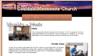
For my final project in user interface design, I had to create “my perfect website”. The website I chose to make is an overhauled version of the Coaldale Mennonite Church website (Note from 2018: This was never submitted to or used by Coaldale Mennonite Church). The website I designed was built using CSS (the dropdown menus are CSS driven), and PHP. The platform we were given to host it on at the college did not have any database support, so I instead built it to parse textfiles rather than running database queries in order to generate the content. The approach I took within the textfile was to create a simple sort of meta language that would define what a line of text was for (and later, a means of parsing multiple lines as a single line). So, there was a prefix code for images, and a prefix code for text, and so on. With the images, I set up the parses so that it would simply alternate the images back and fourth on the left and right hand sides of the page. Since I essentially wanted one picture per section/heading on a given page, this worked well. The results, I think, are actually pretty decent.
When I did usability testing in class with the first web page, one of the key things I wanted to know about was how someone without a church background and without familiarity with church jargon would find the navigation process – how intuitive it would be. One of the key design principles we had hammered into us was “don’t make me think!” As expected, my test subject did experience some confusion, and through the insights I gained, I believe I have constructed an improved menu hierarchy. The original hierarchy was thus: Home | About Us (Statement of Values & Beliefs, Ministry Team, New To CMC?, Career Opportunities) | Get Involved (Children->(Venture Club, Vacation Bible School), Youth->(Junior Youth, Senior Youth, Floor Hockey), Adults->(Small Groups, Men’s Ministies), Seniors, Music, Pray) | Missions and Outreach | Publications (Sermons, Bulletins) | Links (Christian Post Secondary Institutions) | Contact Us.
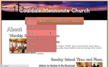
To someone inculcated in Church culture and jargon, many of the above menu items – such as small groups – are fairly obvious. But if someone is looking at this website – say someone who wants to try going to church for the first time – they may not have any idea what a small group is, or who is classified as “jr youth” (grades 7-9) or “sr youth” (grades 10-12). Or they may try searching for worship services under the “pray” submenu rather than the home page. So – apart from trying to create a slick design – I wanted to create a more obvious menu hierarchy. So this is what I came up with: About (Home, Beliefs, Staff & Facility, Location, Contact) | Worship (Worship Services, Music, Hear Past Messages, Prayer) | Groups & Activites (Calendar, For Kids, For Teens, For Adults, For Seniors, For Everybody) | Learning (Sunday School, Links to Bible Schools). In my scheme, I have only four top level menus, and the menus themselves only go one deep (this is part of the reason that I opted not to have breadcrumbs on the site – I felt the site was shallow enough that it would not provide a lot of benefit). And in my scheme, I attempted to use language that was more universal, language that would be more easily understood by non-church goers without obscuring the meaning to church goers who are used to church jargon. This latter part was a challenging balancing act to maintain.

Another challenge I had to overcome was that of actually implementing the dropdown menu system using CSS. I went through a tutorial on how to do it, but my frustration with it was that it did not give a great deal of explanation of the logic behind the different bits of code. Rather, as I seem to recall, it just explained the purpose of the larger blocks of code. Consequently, I had to do quite a bit of mucking around both with the provided CSS and my rendition of the CSS to get what I wanted. Sure, I could have copied and pasted their code in its entirety, but where is the fun in that? What would I have learned from that? Well, after a lot of trial and error I finally got a drop down menu that I was happy with.

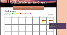
One design element I was particularly pleased with was my calendar. I used color coded icons to represent the different groups within the church that an event might pertain to, and then set it up so that those icons would appear on the calendar wherever an event was scheduled for that group. Then, using CSS, when you hover over the attribute a little box pops up giving further event details.
It should be noted that I did not create the graphics for the site from scratch (though the banner I did do some editing to create a composite image). I pulled images that were archived on the original site, and for those that you can see in my screencaps that were not pulled from the original site the credits follow:
Image Credits
Panorama courtesy of John Fowler (CC) via Wikimedia Commons
Crosses courtesy of Geralt (Public Domain) via Wikimedia Commons
The original site may be found here: CoaldaleMennoniteChurch.org
